logo design (2023-)
Logo design is an important part of a brand's visual identity and often serves as the first point of contact between the customer and the company. In this section, I present my client projects, where I have created unique logos for various industries.
My work focuses on visually capturing the core message and values of the brand. A good logo is not only aesthetic; it also communicates the character and objectives of the company. Throughout my design process, I pay special attention to the small details that create associations and deepen the logo's meaning. These details can relate to the company's operations, values, target audience, or personnel, allowing the logo to convey more than just a visual appearance.
I believe that over time, a well-designed logo becomes an important and memorable symbol for the target audience, signifying its success. My portfolio includes examples of logos I have designed for various clients. In these projects, I strive to combine creativity and strategic thinking so that each logo is not only beautiful but also an effective brand communicator.
Jumping Technique (2024)
This project aimed to develop a dynamic and energetic logo that captures the essence of dog jump technique training. The design brief emphasized the need for a logo that conveys movement and incorporates bold, clear colors to reflect the athletic nature of the sport. Given the fast-paced and sports-oriented context, it was crucial to integrate the image of a dog into the design.
In the final logo, I utilized typography to visually represent the dog’s jump course, with the letters themselves embodying the fluidity and agility of the technique. Subtle illustrations of a dog are strategically placed at the beginning and end of the logo to enhance the sense of motion and continuity. The hand-drawn elements add a touch of authenticity and warmth, highlighting the meaningful bond between the person and their own dog. The color palette features strong, primary hues set against high-contrast backgrounds to ensure the logo’s visibility and impact, underscoring the vigor and energy of the sport.


Tasa-arvotoimisto Havu (2024)
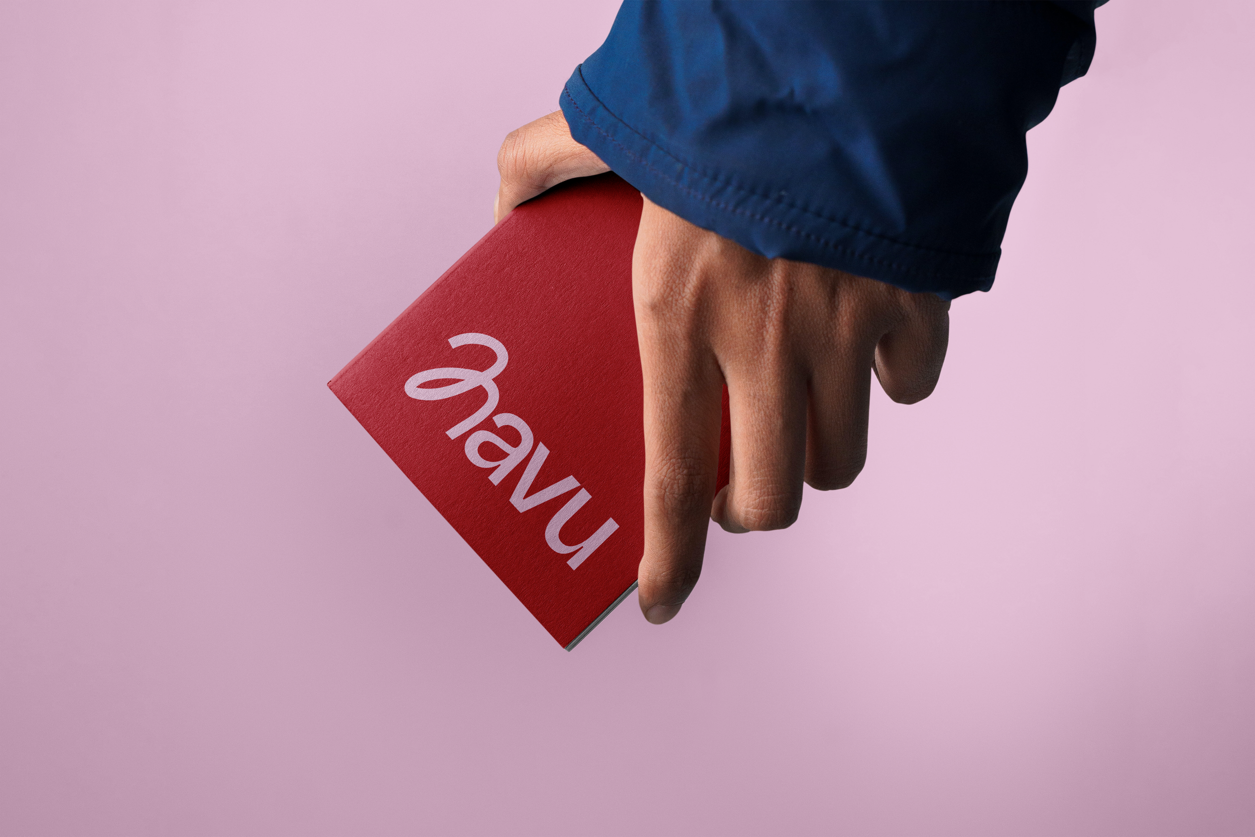
The assignment was to create a modern and impactful logo for an equality office that incorporates the colors of the rainbow and femininity. The goal was to develop a bold and contemporary design that communicates care and equality.
I designed a logo that combines modern aesthetics, the values of equality, and femininity. The logo package is versatile, with the aim of creating a design that serves as a strong foundation for building the company’s overall brand. The playful "H" forms a pattern that merges abstract yet fluid movement, symbolizing unity and respect for diversity. The primary logo features the colors of the rainbow, while variations in cherry red and light pink add richness to the branding. The logo is memorable, with subtle references to equality, and is designed to stand the test of time.


Humppilan kunta (2023)
Competition proposal for the 150th anniversary of Humppila Municipality. In the competition, I designed a logo that is modern and up-to-date while still conveying local identity. In the logo, each number incorporates important characteristics of the municipality: craftsmanship, entrepreneurship, and cohesion. The significance of the content is revealed in the final number.
The logo is designed to be versatile across different platforms, with scalability in mind. It can be used in both small and large sizes without losing readability or overall appearance.


